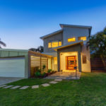


Every year we wait in anticipation for the following year’s colour trends to be announced by Australian paint experts. And so, the time has come!
If you’ve been ‘umm’ing and ‘ahh’ing about undertaking an interior makeover, nothing does the job like a fresh lick of paint – and now is the time. Dulux, Wattyl and Porter’s Paints have just released their 2022 colour forecasts for you to feast your eyes upon; and believe us when we say, they’re sure to please no matter what your style or taste. Gone are the days of bland black and white, it’s time to welcome back colour and texture.
Despite the varied tones and hues, one thing remains in common within these palettes: they are derived from our want for new freedoms and change, and our determination to be bold and expressive as we embrace a ‘new normal’. “The desire to create beautiful spaces gets stronger as the world gets more unpredictable – colours can calm and soothe us, just as colours can make us restless or uncomfortable,” says Melanie Stevenson, Brand Manager at Porter’s Paints.
So, without further ado, here are the colours that will be gracing our walls, doors, furniture and homewares in 2022 – according to experts.
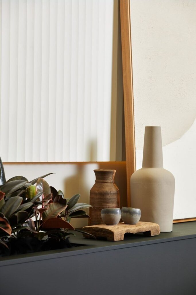
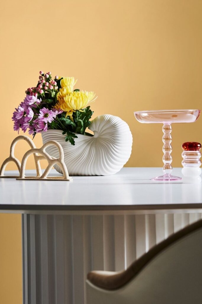
Neutral shades
As seems to be the overall theme for the year, interior palettes are grounded in a desire for simplicity, warmth and calm. Because of this, we are seeing hard, cold greys and neutrals left behind, in favour of soft neutrals.
“Having spent so much time on our devices, we yearn for tactile experiences and a connection with our loved ones as well as nature, seeking out natural fibres and materials, such as raw timber, unstructured linen and textured stone,” says Andrea Lucena-Orr, Dulux Colour and Communication Manager.
The sentiment is echoed by Marylou Cafaro, Colour and Design Expert at Wattyl: “Serene colours and subtle tactile surfaces, influenced by nature, invite us to slow down, pare back and live in the moment.”
Neutral paint shades you should try
- Rice Crop – Dulux
- Stow White – Dulux
- Driftwood – Wattyl
- Vitesse – Wattyl
- New Penny – Dulux
- Hog Bristle Half – Dulux
- Dhimba – Wattyl
- Signal Station – Wattyl
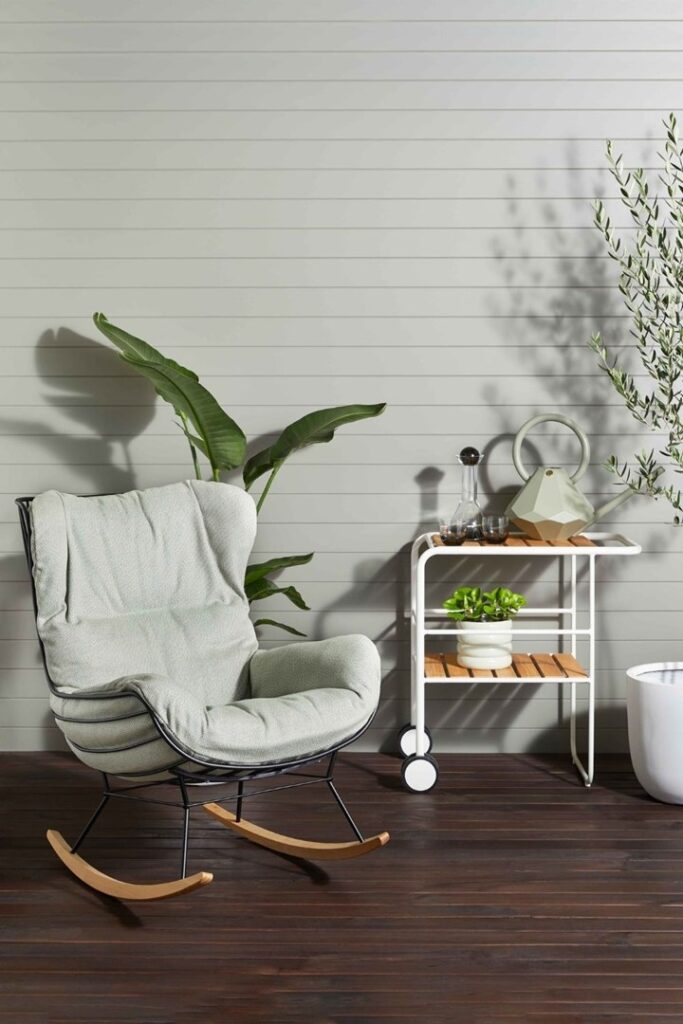
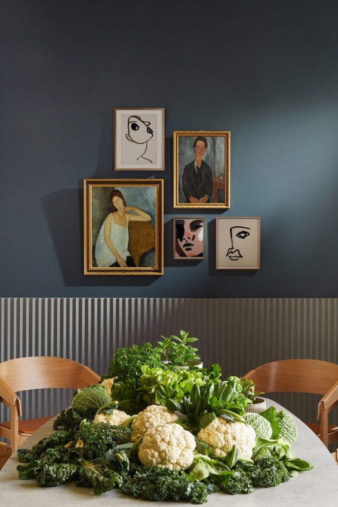
Nature-inspired
Tones we see within our environment are set to make themselves known indoors. These nature-inspired hues instill nostalgia for our outdoor surrounds, with a definite Australian tilt; gentle, earthy neutrals meet more raw and rugged tones of clay, rich forest green, and moss. It asks us to move away from beige and boring, inviting us to celebrate colours that are pared-back and gentle.
“Green-infused colours, textured walls, timber and stone elements, lots of planting and nourishing daylight, all combine to embrace the innate need to bathe in nature,” says Cafaro.
Nature-inspired paint shades you should try
- Shelter Cove – Wattyl
- Olive Grove – Porter’s Paints
- Colourbond Mangrove – Wattyl
- Natural Flora – Dulux
- New Penny – Dulux
- Highlands Grey – Porter’s Paints
- Ōpononi Double – Dulux
- Beach Life – Wattyl
- Billy the Kid – Wattyl
- Red Ochre – Porter’s Paints
- Hailstorm – Porter’s Paints
- Parched Peat – Wattyl
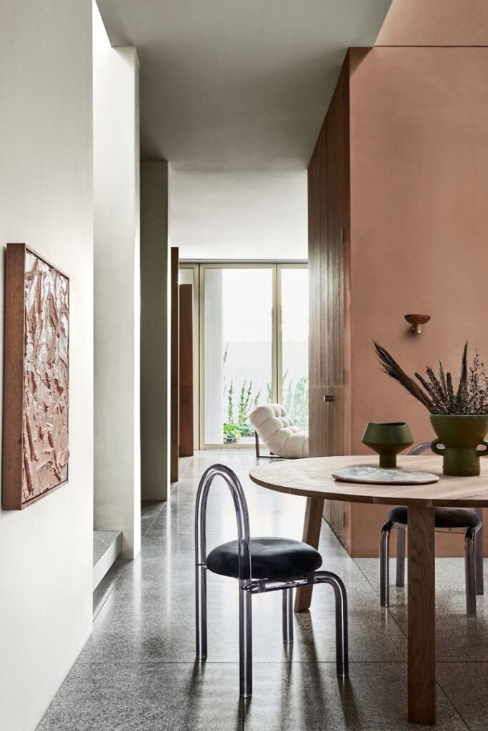
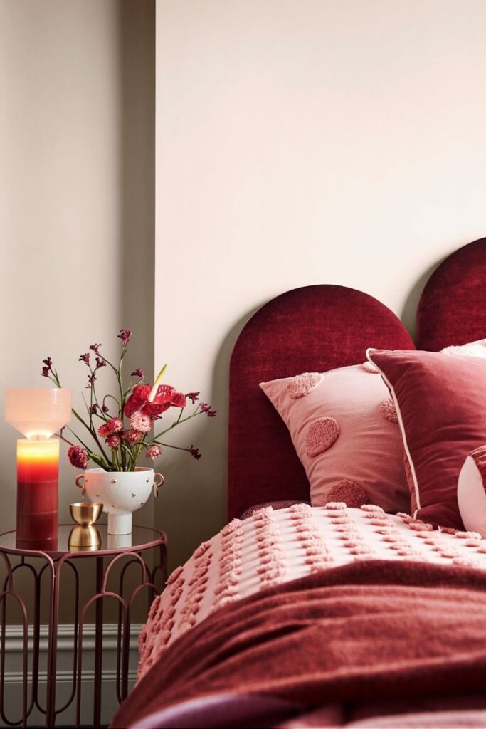
Rich and luxe
We are collectively embracing life after 2020 and 2021; things that were once mundane and unspectacular have suddenly sparked inspiration and a renewed sense of adventure and wonder. These are reflected in our interiors with bold contrasts in a celebration of resilience, passion, expression, diversity and strength.
“Interiors are layered, expressive and unapologetically individual, with decadent fabrics such as velvet, silk and natural leather, paired with one-off vintage finds, such as a quirky 1960s lamp or an authentic 1940s mirror,” says Lucena-Orr.
Rich and luxe paint shades you should try
- Dragon’s Eye – Porter’s Paints
- Lavish Tan – Wattyl
- Excalibur – Wattyl
- Red Terra – Dulux
- Tumeric – Porter’s Paints
- Deep Leather – Dulux
- Sundance – Porter’s Paints
- Benang – Dulux
- Murray Red – Dulux
- Gold Vintage – Dulux
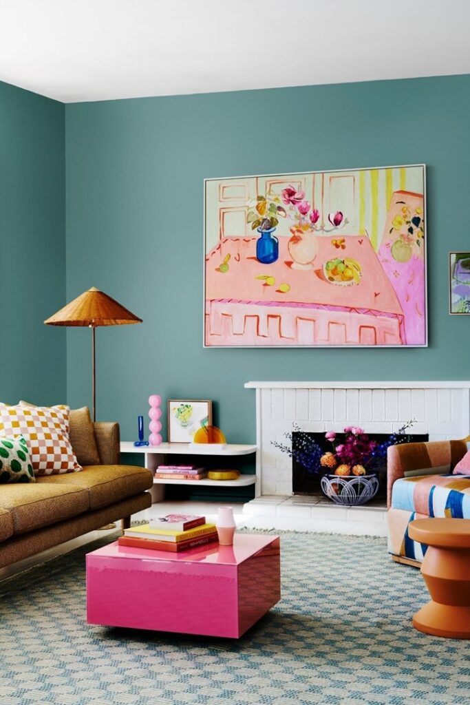
A pop of colour
As 2021 draws to a close, there’s an undeniable sense of celebration, excitement and reawakening in the air – and it’s set to be reflected in our interiors. We are ready to welcome fun and playfulness back into our lives as we view the world with a sense of child-like wonder, as if for the very first time. We yearn for days when things were simpler and less serious, and as such we see bright and lively colours coming together in unexpected ways.
“Colours are playful, summery and 80s-inspired – think cornflower blue, lilac, lemon, green quartz and rose gold. Together, they create a dreamy and sentimental feeling that evokes memories of carefree days and helps us imagine possibilities going forward,” says Lucena-Orr.
Bright and colourful paint shades you should try
- Rock Salt – Porter’s Paints
- Pinkham – Dulux
- Pax – Dulux
- Yellow Sun – Wattyl
- Osiris – Wattyl
- Rousillon – Porter’s Paints
- Edvard – Dulux
- Harmonious – Dulux
- Lavender Splash – Wattyl
- Sandpaper – Dulux
- Pink Papaya – Dulux
- Sassy – Dulux
Source – BHG.com.au
Disclaimer: The opinions posted within this blog are those of the writer and do not necessarily reflect the views of Better Homes and Gardens® Real Estate, others employed by Better Homes and Gardens® Real Estate or the organisations with which the network is affiliated. The author takes full responsibility for his opinions and does not hold Better Homes and Gardens® Real Estate or any third party responsible for anything in the posted content. The author freely admits that his views may not be the same as those of his colleagues, or third parties associated with the Better Homes and Gardens® Real Estate network.